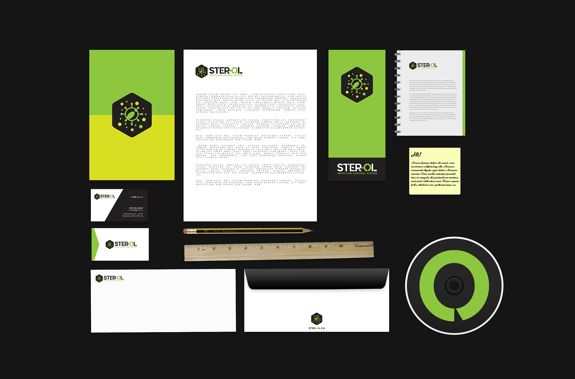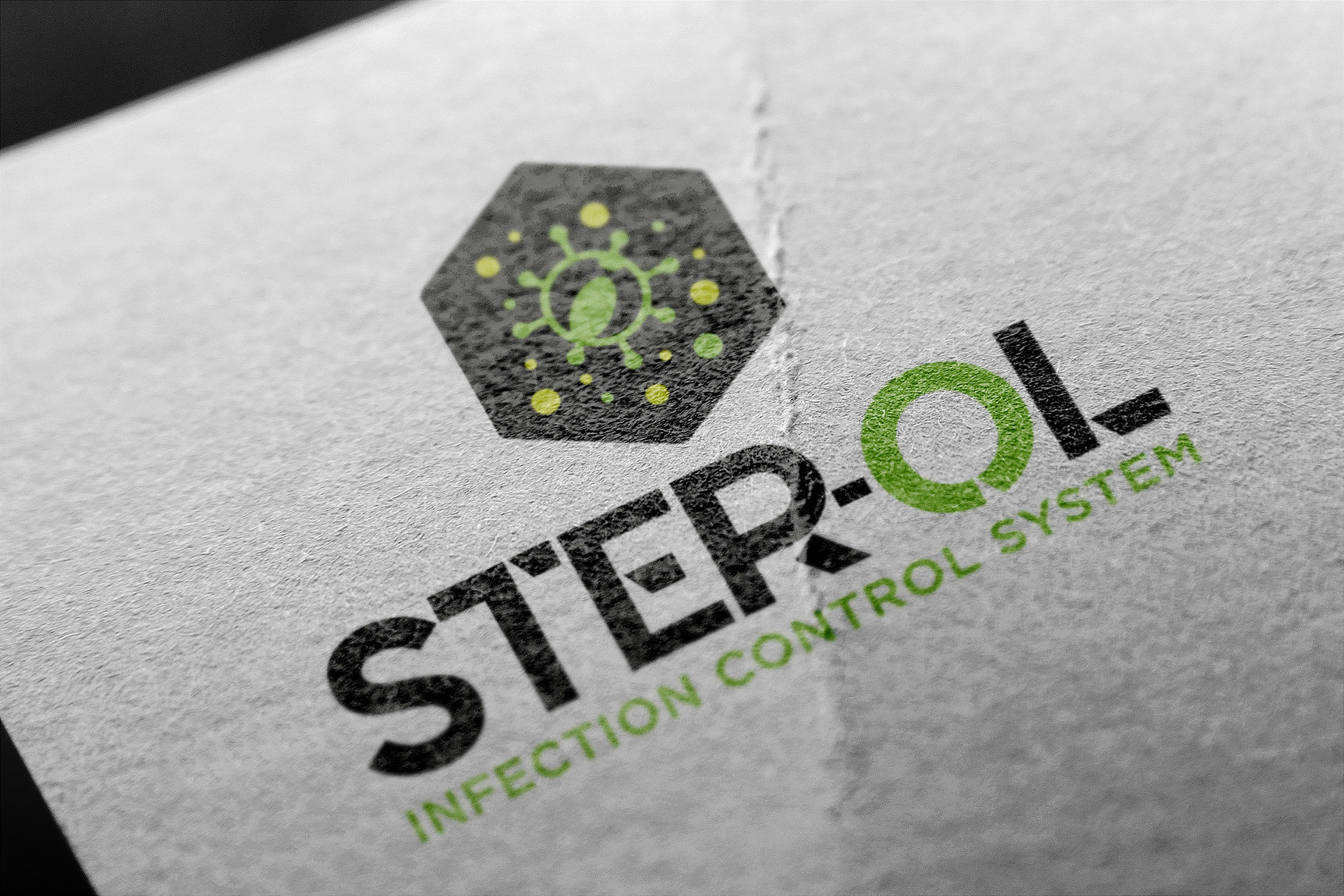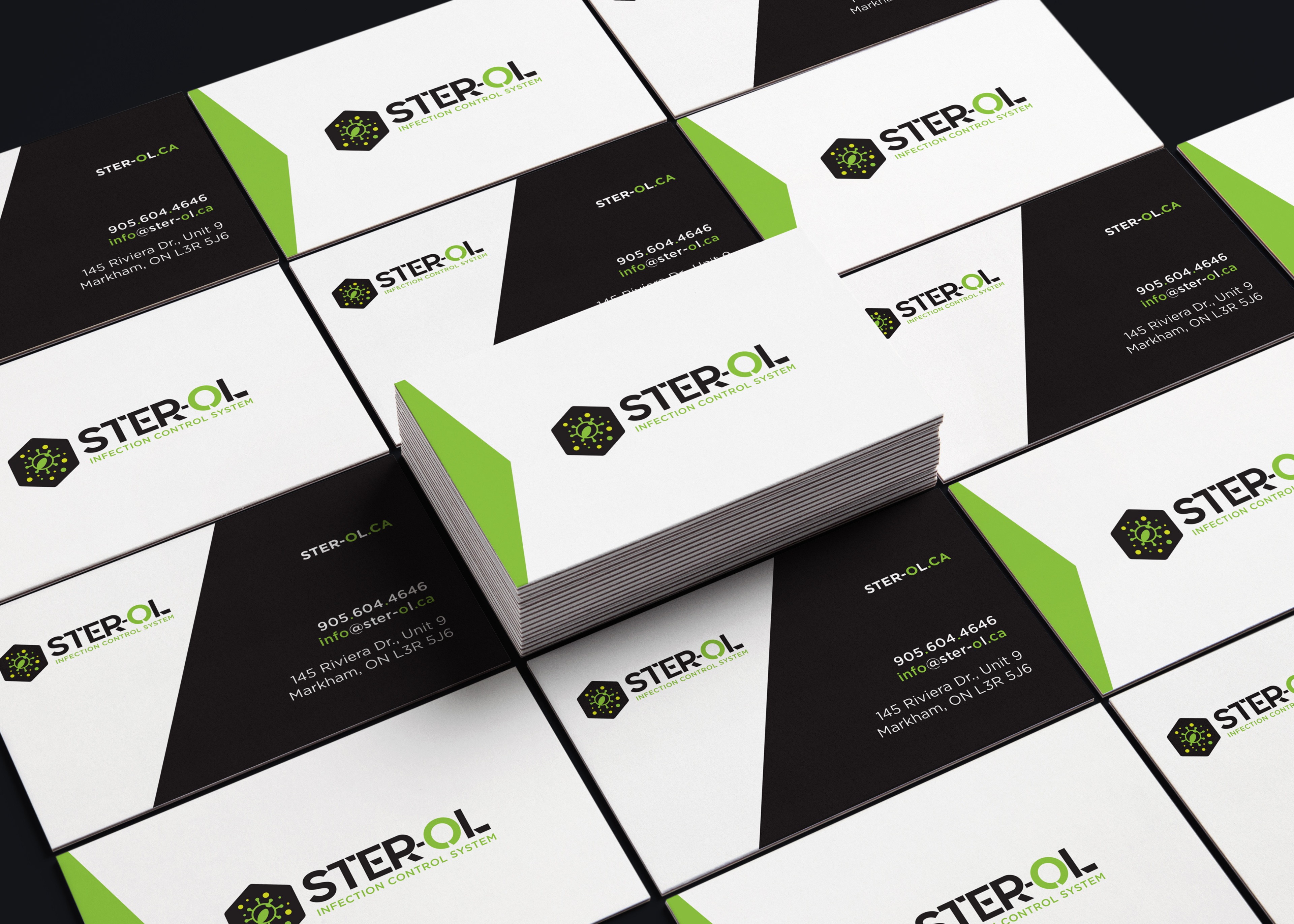
This company entered the market at a time when their product is needed most. Having a brand identity that stood out against the competition is key. The final logo contains elements that speak to what the company does. Having the germ contained in the hexagon depicts its ability to control the virus. The meaning of the ‘O’ in a different colour displays how the company is, all around, completely limiting the spread of infection.